|
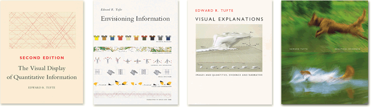
Note: A just slightly different version of this review has been published in Information Design Journal 15(2), 2007 (pp. 190-193, available here). A review of Edward Tufte’s ‘Beautiful Evidence’ Information design as a field owes a lot to Edward Tufte. With his bestselling books The Visual Display of Quantitative Information (1983), Envisioning Information (1990), and Visual Explanations (1997), Tufte has successfully been drawing the attention of countless people to issues of information design. |
|
Tufte has provided the discipline with a vocabulary for bad design (chartjunk, the lie factor), for particular graphic constructions (small multiples, micro/macro readings), and for his own criteria of good design (high data-ink ratio, high data density). His fourth book on the subject is titled Beautiful Evidence (2006, abbreviated below as BE). In this review I will, after some general observations, make some brief remarks about each of the nine chapters, and then conclude with two aspects of the book about which I have critical comments. (Update: Stephen Few has made a few observations about Beautiful Evidence that are quite similar to the ones that I making here - see his review online, or download it as a pdf, 250 kb.) Beautiful Evidence fulfills the expectations of yet another superbly crafted showcase of interesting visuals. Tufte continues to practice what he preaches about visual design. To name just one little layout detail: the reader never has to turn a page to finish reading a sentence (with one exception on p. 37). In the process of writing and editing this book, Tufte made use of the Internet: he posted the drafts of three of the first four chapters on his website (Ask E.T.), inviting comments. Many visitors reacted, posting corrections and suggestions (see, for example, the discussion of the draft for the chapter on links and causal arrows). My impression is that this has contributed to the ripening of these chapters, and I believe that the last four chapters could have benefited from the same feedback procedure (see below, in my remarks about the chapters). Diversity of chapters In the first chapter, titled “Mapped pictures”, Tufte discusses pictures of physical things. He advocates the mapping of pictures, which is his term for visually annotating pictures with scales of measurement, labels, relevant comparisons, and explanatory diagrams that are placed next to, or are overlaid on the pictures. He illustrates this with numerous interesting examples, and notes that for many presentations, “it will be useful to show viewers both the unmapped and the mapped images” (BE, p. 45). The second chapter is devoted to Tufte’s intriguing concept of sparklines. He also refers to sparklines as “wordlike graphics” or “datawords”. A sparkline usually consists of either a fluctuating line like in a line chart, or of a string of very tiny bars. It is usually longer than high, and is not accompanied by an x- or y-axis or other scale. A sparkline enables the visual display of a large amount of data in a tiny space. In addition, sparklines are often presented in a set, enabling comparisons between the data in different sparklines. Tufte presents interesting examples of sparkline uses, and provides practical advice for their design (some draft pages for this chapter can be seen here). In his third chapter Tufte points out that the various arrows or linking lines within a diagram are often all identical to each other visually and ambiguous in their meaning. He recommends that “arrows, links, and other connectors should become more articulate, more differentiated, less generic.” (BE, p. 70). Appealing examples of careful annotations of connectors, and of rich visual vocabularies of links or arrows in diagrams are presented (some draft pages for this chapter can be seen here). In the next chapter, Tufte advocates the practice of tightly integrating text and images, in close adjacency within the same visual field, weaving them into meaningful relationships with each other. As examples of good practice in this respect, Tufte shows us manuscripts by da Vinci, Galileo, Newton and others. Bad examples are books in which all images are banned to a separate appendix at the end of the book. “The fundamental principles of analytical design” is the title of the fifth chapter of Beautiful Evidence. Here Tufte provides an in-depth analysis of the by now well-known graphic showing the devastating losses of the French Army in Napoleon’s Russian campaign (drawn by Charles Joseph Minard). |

|
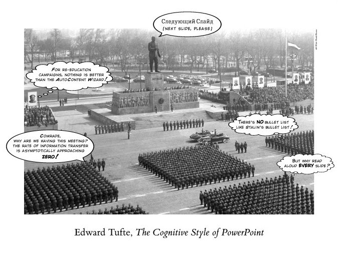
This graphic was basically unknown before Tufte introduced it to the world in his book The visual display of quantitative information (1983). Now, twenty-six years later, he uses it again to illustrate and explain in detail his six fundamental principles of analytical design, which he formulates as: 1) Show comparisons, contrasts, differences. 2) Show causality, mechanism, explanation, systematic structure. 3) Show multivariate data; that is, show more than 1 or 2 variables. 4) Completely integrate words, numbers, images, diagrams. 5) Thoroughly describe the evidence. Provide a detailed title, indicate the authors and sponsors, document the data sources, show complete measurement scales, point out relevant issues. 6) Analytical presentations ultimately stand or fall depending on the quality, relevance, and integrity of their content. Tufte declares that “The purpose of an evidence presentation is to assist thinking”, and that these six principles of analytical design “are derived from the principles of analytical thinking.” (BE, p. 137). He claims that these design principles are universal and “not tied to any particular language, culture, style, century, gender, or technology of information display.” (BE, p. 10). This last claim may be disputable, but I certainly appreciate both this “Napoleon-chapter” and the sparkline-chapter as logical and useful continuations of Tufte’s highly regarded work. Chapter six, “Corruption in evidence presentations”, consists of a collection of Tufte’s critical thoughts on topics such as mediation and marketing of evidence, “bureaucracies of secondary presentation”, problems of vague formulations in texts, and the use of punning instead of good statistics. Little in this chapter is concerned directly with issues of visual presentation (some draft pages for this chapter can be seen here). In the following chapter Tufte attacks PowerPoint, talking for example about “the weakness of bullet outlines for thinking about causality” (BE, p. 170). Most of this chapter has already been published by Tufte in 2003, as a separate pamphlet with the same title: The cognitive style of PowerPoint: Pitching out corrupts within. In the same year Tufte published an article in Wired Magazine, titled “PowerPoint Is Evil”. Three years later, in Beautiful Evidence, Tufte’s assault on PowerPoint remains the same, while in the meantime it has been triggering various quite critical reactions. For example, cognitive psychologist Donald Norman, author of books such as The design of everyday things and Emotional design, responded to Tufte’s pamphlet with an essay titled: In defense of PowerPoint. Reacting to Tufte’s denunciation of PowerPoint, Norman writes, “I respectfully submit that all of this is nonsense.” According to Donald Norman, Tufte fails to distinguish between the needs of the audience at an oral presentation and the needs of readers of printed documents. As David Farkas writes, “Probably the biggest problem in Tufte’s […] commentary is that he argues as though slides were free-standing graphics without any connection to a presentation” (David Farkas in “Toward a better understanding of PowerPoint deck design”, Information Design Journal 14(2), full text available here). Tufte offers a fierce and detailed critique of a key NASA PowerPoint slide that presented the (underestimated) risk of damage of the space shuttle Columbia, before the Columbia burnt up during atmosphere reentry, killing the seven astronauts on board. Tufte seems to blame PowerPoint. Donald Norman disagrees: “I differ most strongly with this assessment. Yes, the slide is very bad. Yes, it is almost incomprehensible. But in my opinion, the slide should have less information on it - Tufte wants more information” (Donald Norman: In defense of PowerPoint). Jumping from PowerPoint to sculptures, Tufte presents his final chapter, “Sculptural pedestals: Meaning, Practice, Depedestalization”. Here Tufte’s plea is to minimize the pedestals (often blocks of concrete) on which sculptures are placed. He writes: “Representing the physical and symbolic transition from ground-flatland to sculpture-spaceland, the intersection of land and sculpture announces the beginning of art.” (BE, p. 187). A two-page interview is included with someone who used to pull down and smash statues of the Shah of Iran, leaving behind empty pedestals (BE, pp. 190-191). I have to admit that I find it difficult to see the coherence here, both within this chapter and in relation to the other chapters. The last fourteen pages of the book are filled with double spread photographs of Tufte’s own landscape sculptures. These are indeed without pedestals, but also without any explanatory text. (Update: In the second printing of the book, in May 2007, Tufte has added an introduction to his sculpture photographs.) You can see Tufte’s sculptures the sculpture section of his website, and also in this illustrated article in Stanford Magazine. Running out of focus? Starting with his first book on the visual display of information in 1983, Tufte has been enriching the vocabulary of information design with his influential concepts. In Beautiful Evidence he adds the valuable concept of “sparklines” to the list. However, while The Visual Display of Quantitative Information (1983) and Envisioning Information (1990) are undisputed classics and required reading for everyone seriously interested in information design, Visual Explanations (1997) and Beautiful Evidence (2006) both appear less focused. My general impression is that the first part of Beautiful Evidence - chapters 1 through 5 (pp. 1-139) - will be of more use to readers interested in information design than the second part of the book - chapters 6 through 9 (pp. 140-209). |
|
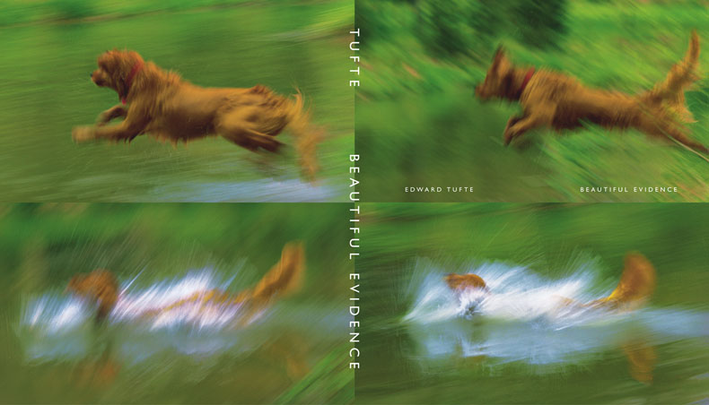
I may have been spoiled by the careful and logical development of Tufte’s arguments in his first two books on the subject. In comparison, Beautiful Evidence comes across as a collection of sometimes only loosely related essays, occasionally straying into discussions of painting (works by Cézanne, Matisse, Picasso, and others are discussed), sculpture, bureaucracy, language use, and other issues. Concerning Tufte’s well-known focus - the visual display of information - it seems that in Beautiful Evidence, he is, at times, running out of focus. Coincidently, the book’s dust jacket design - the significance of which is not explained - consists of four photographs of a dog running, out of focus. Tufte’s rhetoric A second slight disappointment that I experienced reading Beautiful Evidence relates to the style of argumentation in some sections. As Tufte points out, “blatant rhetorical ploys” suggest “that the presenter lacks both credibility and evidence.” (BE, p. 141). However, Tufte makes abundant use of “blatant rhetorical ploys” himself. For example, to support his claim that his design principles are universal across cultures, he points out that the illustrations in Beautiful Evidence come from “16 countries (Italy and France, especially), 3 planets, and the innumerable stars” (BE, p. 10), as if these drawings of planets and stars (mostly by Galileo) have been designed by creatures from extra-terrestrial cultures (who are using those same universal design principles as we humans do). Here Tufte conflates diversity of objects of visualizations with diversity of (cultural backgrounds of) designers of visualizations. Regarding the low information density of many PowerPoint slides, Tufte writes: “The resolution of printed-out slide decks is remarkably low, approaching dementia.” (BE, p. 180). Next to a number of screenshots with PowerPoint templates, he shows a brief excerpt from a children’s book “I want my ball. My ball is yellow. It is a big, pretty ball.” (BE, p. 177). He makes a comparison between PowerPoint’s cognitive style and “Stalin-cult propaganda” with “orderly followers feigning attention”, and he illustrates this comparison with a photograph of a military parade in front of a statue of Stalin who is commanding: “Next slide, please” (BE, p. 185). |
|
I have always been, and still am, a great fan of Edward Tufte’s work, and I feel almost a bit embarrassed about some of the sections of Beautiful Evidence from which I have quoted above. Abducting Tufte’s own words to express this feeling of embarrassment, “few things are more appalling than listening to inept and specious arguments made by one’s allies.” (BE, p. 141). Yuri Engelhardt, November 2007 |